

If I hid the logo on your product, would anyone still recognize the brand?
That question tells me more than whether a logo looks good. When a brand only becomes recognizable after its name appears, it hasn’t built a world of its own. It has simply signed something generic.
Teenage Engineering, Smythson, and Officine Universelle Buly are three useful brand differentiation examples because each made its difference tangible.
One did it through the product. Another through brand codes. The third through experience.
TEENAGE ENGINEERING — DIFFERENCE LIVES IN THE PRODUCT
For years, serious music technology had to look serious: black boxes, crowded panels, and rows of gray buttons. Teenage Engineering turned synthesizers into objects that feel like a professional studio, a Scandinavian design shop, and a box of LEGO somehow ended up in the same room.
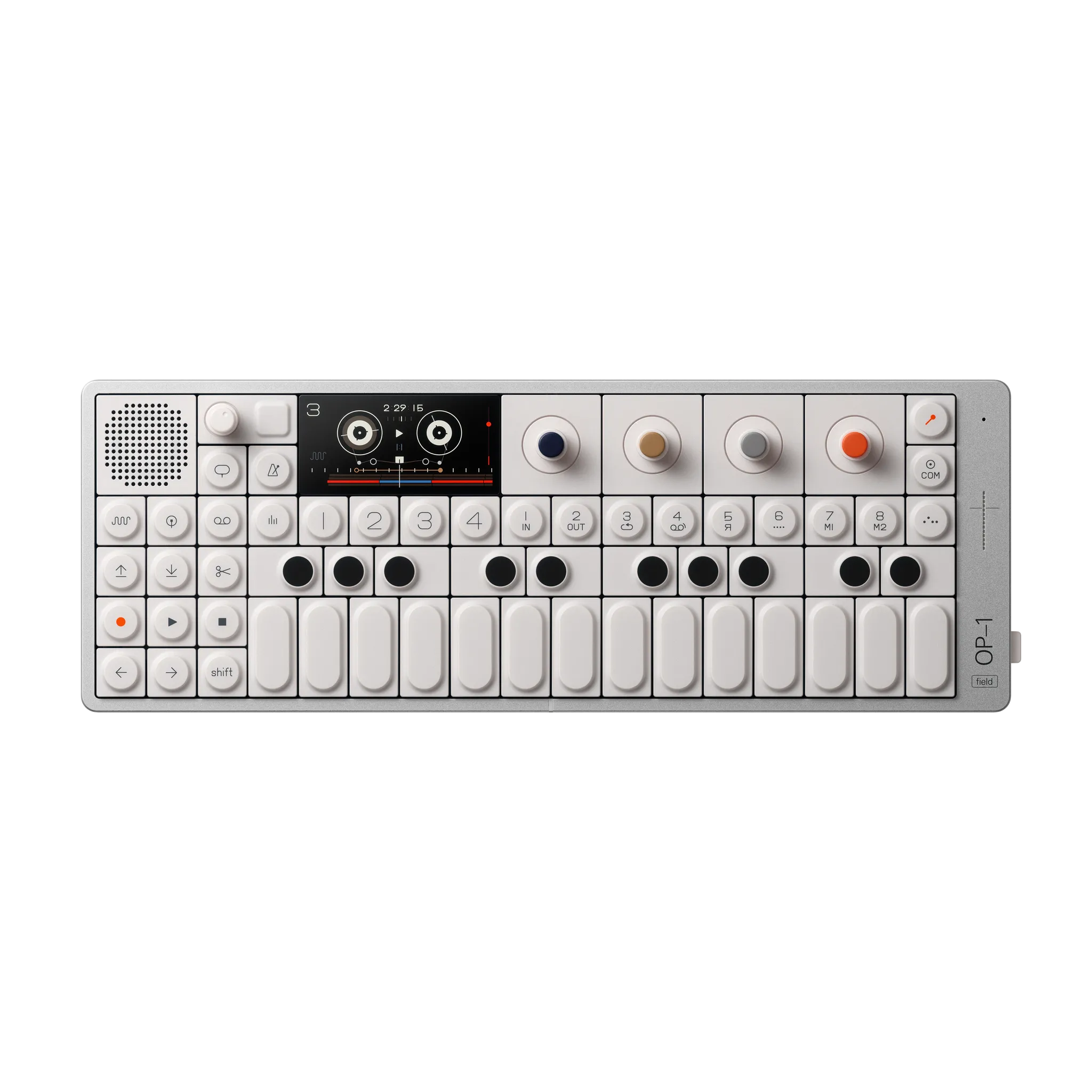
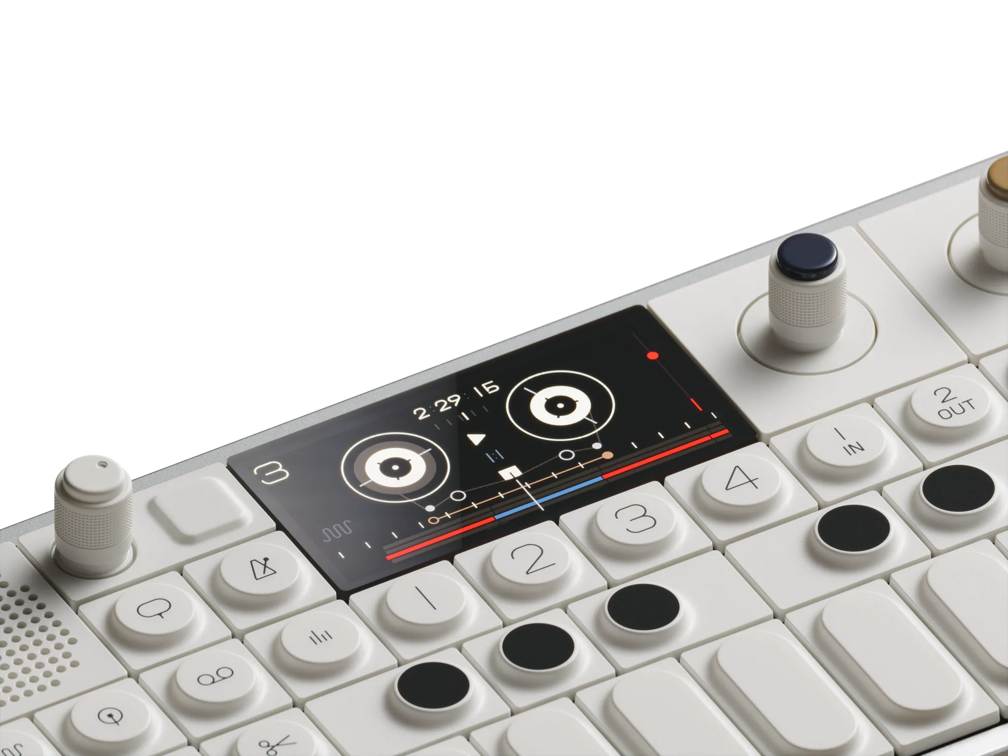
The company didn’t simplify its products until they felt cheap. It made sophisticated products feel fun. The OP-1’s toy-like appearance was even used as criticism, but the company treated it as a compliment: beneath the approachable design were real technical depth and professional specifications. Inside Design
You don’t need to understand every feature to want the object. Its identity lives in its shape, materials, interface, and even the sound of a button.
The more generic the product is, the harder communication has to work to prove there is a difference. Teenage Engineering turned the product itself into communication.
SMYTHSON — DIFFERENCE LIVES IN THE CODES
In 2026, what is the rational reason to buy a luxury notebook?
Notion can organize more information. Your phone is always in your pocket. An iPad never runs out of pages. None of them makes you find a pen before you can capture an idea.
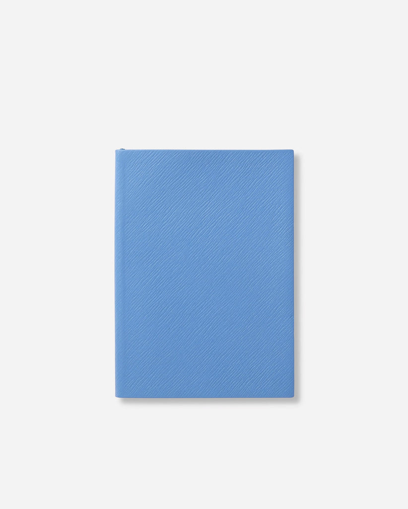
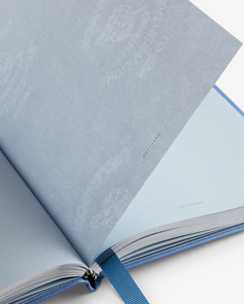
But Smythson isn’t selling efficiency. It sells the pleasure, ritual, and social code of writing in a special object. In 1908, Frank Smythson registered the feather symbol still associated with its Featherweight Paper—paper far thinner and lighter than conventional stock, yet tested to hold fountain-pen ink. Smythson
Nile Blue appears across the paper and packaging until it works like a silent logo. Then titles such as “The Boss,” “Out of Office,” and “Shhh” place a little British irony inside an otherwise polished system. Smythson Titled Notebooks
The value comes from recognition. Your brand doesn’t need to shout, but it does need to own something—a color, material, word, or gesture—and repeat it until it stops being decoration and becomes property.
OFFICINE UNIVERSELLE BULY — DIFFERENCE LIVES IN THE EXPERIENCE
Walk into ten beauty brands today and you’ll probably find white space, pastel colors, sans-serif type, and clinical packaging. The aesthetic has become so dominant that it is starting to disappear from overexposure.
Buly went in the opposite direction. Instead of presenting itself as beauty from the future, it created a journey into a 19th-century Parisian pharmacy.
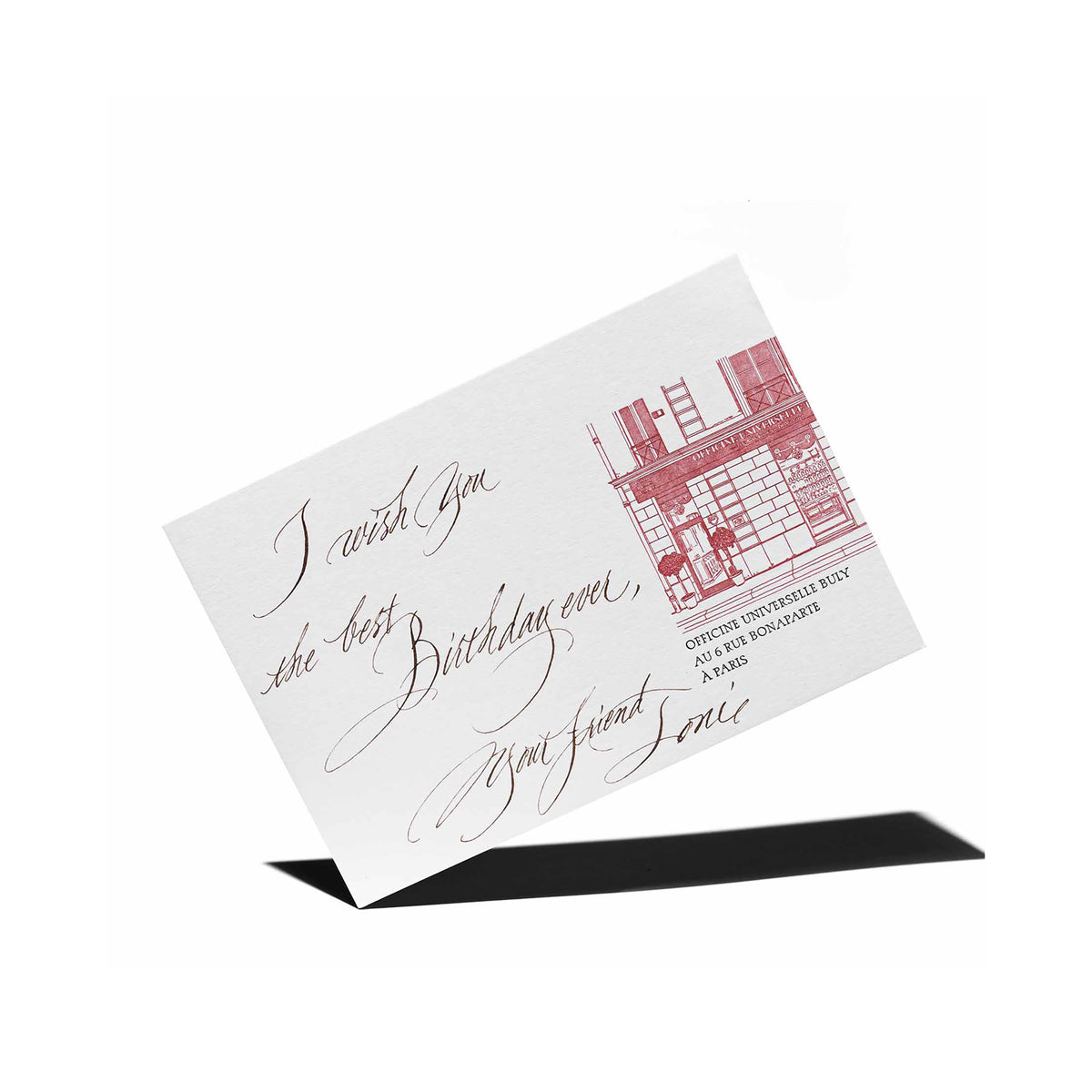

Its stores combine dark wood, marble, antique faucets, laboratory vessels, and glass or ceramic jars. The brand describes every location as a manifesto against standardization: each store absorbs something from its host city while preserving the world of old French officines. Officine Universelle Buly
Purchases can include a handwritten calligraphy message and wrapping inspired by origata, the Japanese art of gift wrapping. Personalization and packaging don’t feel like optional extras. They are chapters of the same story. The Art of Gifting
That turns a transaction into a ceremony.
Brand experience isn’t a good playlist and free coffee. It is making the service, space, packaging, and pace of the purchase tell the same story.
WHICH RULE DOES EVERYONE IN YOUR CATEGORY KEEP FOLLOWING WITHOUT KNOWING WHY?
I would look at five things: does the product carry identity? Which brand codes work without the logo? What part of the experience could become a ritual? Which category cliché would create contrast if you abandoned it? And would you repeat that choice long enough for the market to learn it?
To me, differentiation isn’t about being weird for attention. It is choosing an idea your category doesn’t own and translating it with enough coherence that, over time, it starts to feel like yours.
Being different for one campaign is easy. Being recognized without having to explain yourself is much harder—and much more valuable.
SO, WHERE HAS YOUR BRAND CHOSEN TO BE DIFFERENT?
