HOWTOTURNRAWHUMANEFFORT INTOAPOWERFULVISUALNARRATIVE?
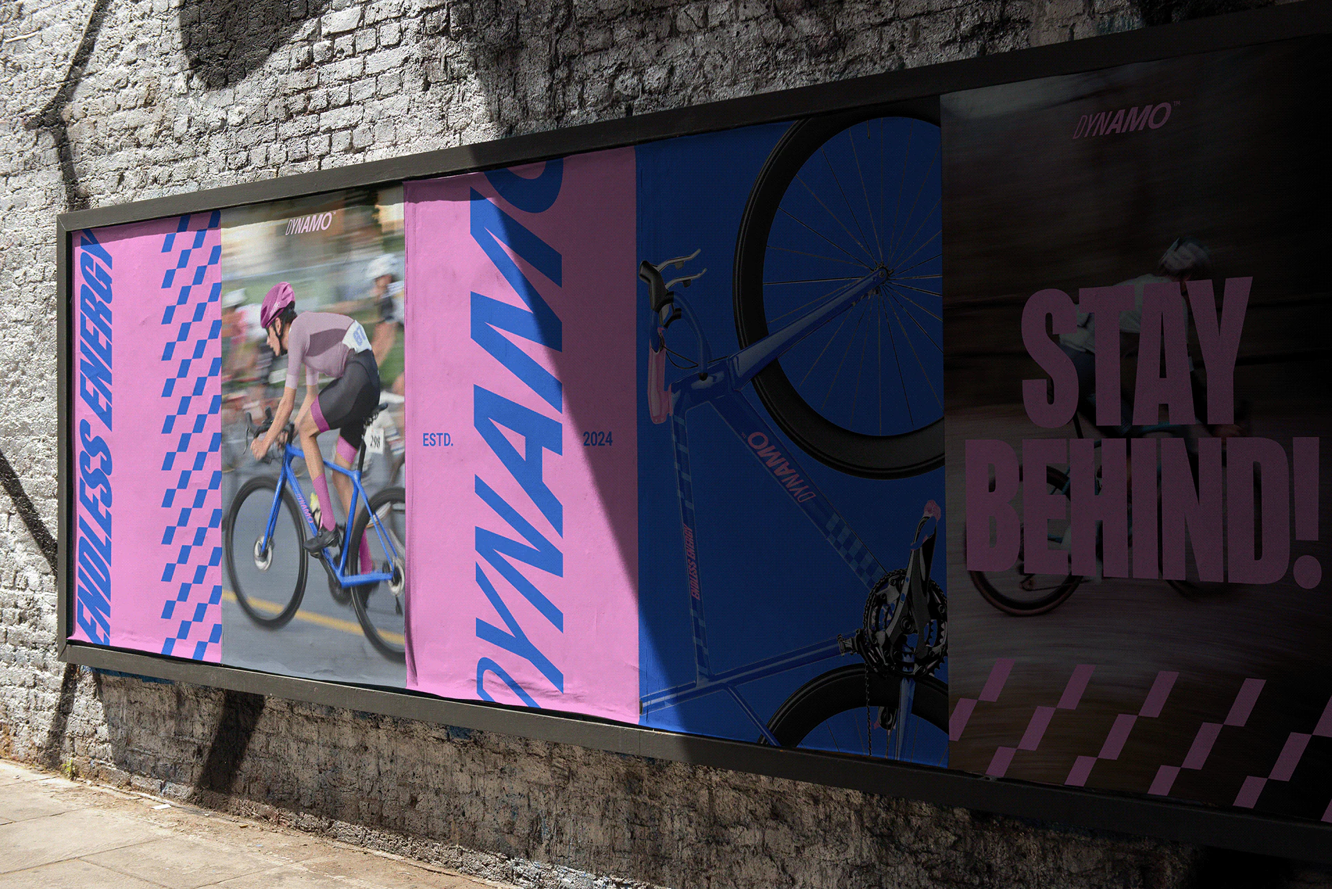
Across the cycling world, countless teams blend into the background with generic logos and uninspiring gear. In a high-speed sport where split-second recognition is everything, a team’s visual identity cannot be just an afterthought on a jersey; it must be a powerful translation of raw human effort into pure momentum.
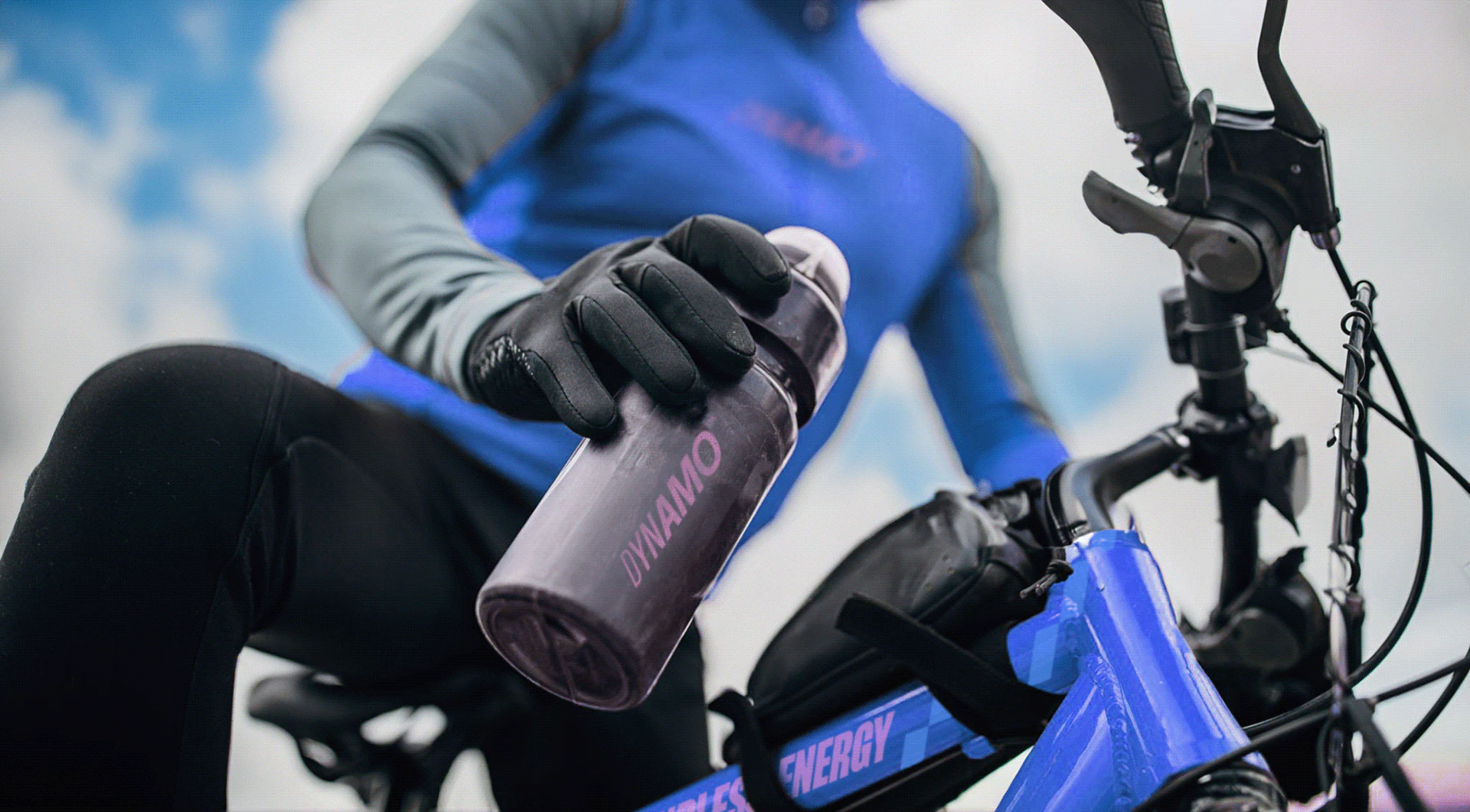
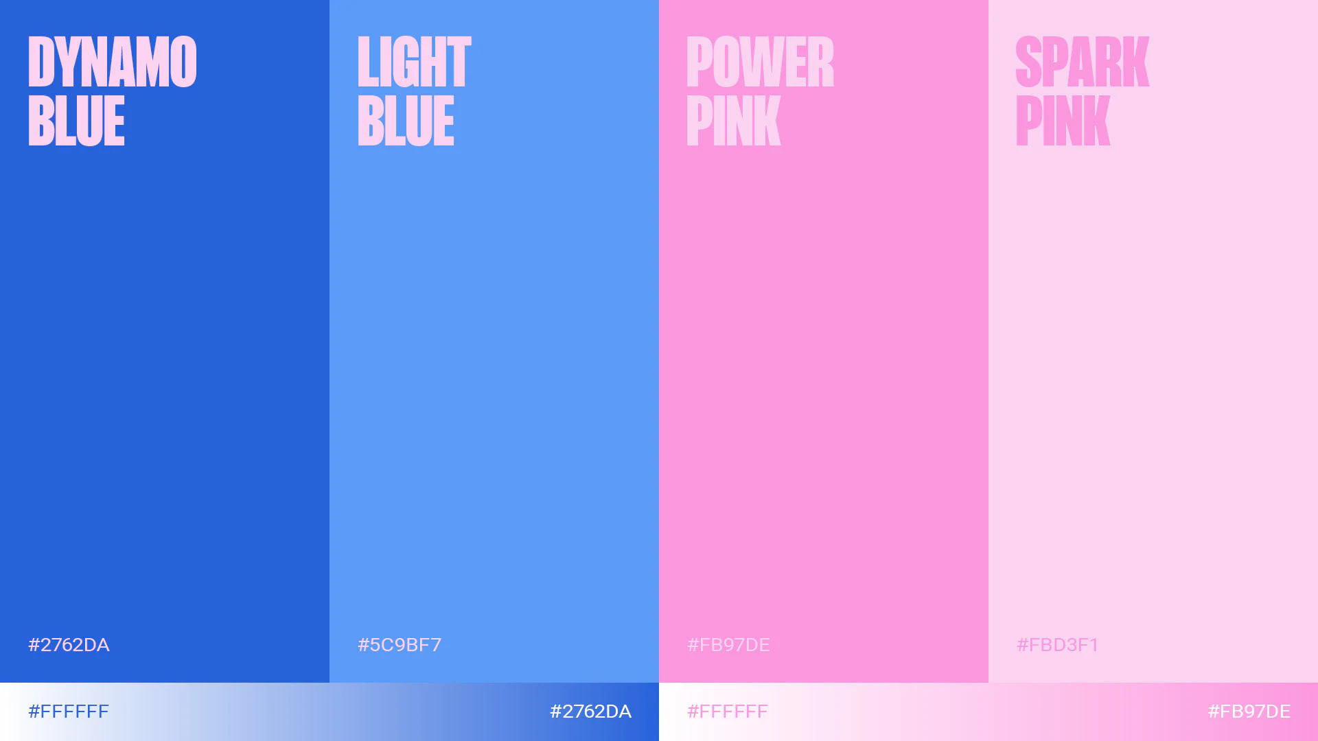
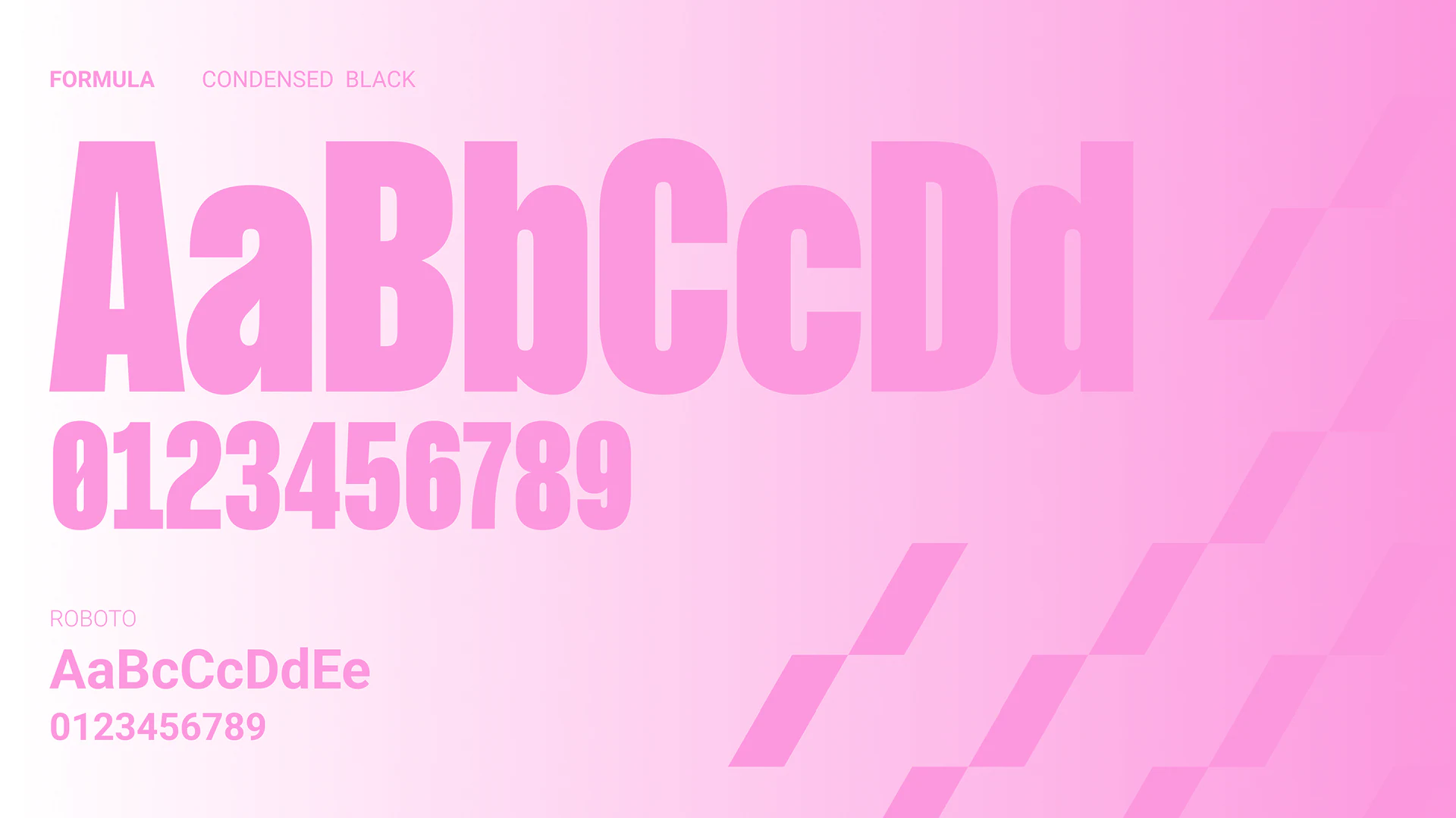
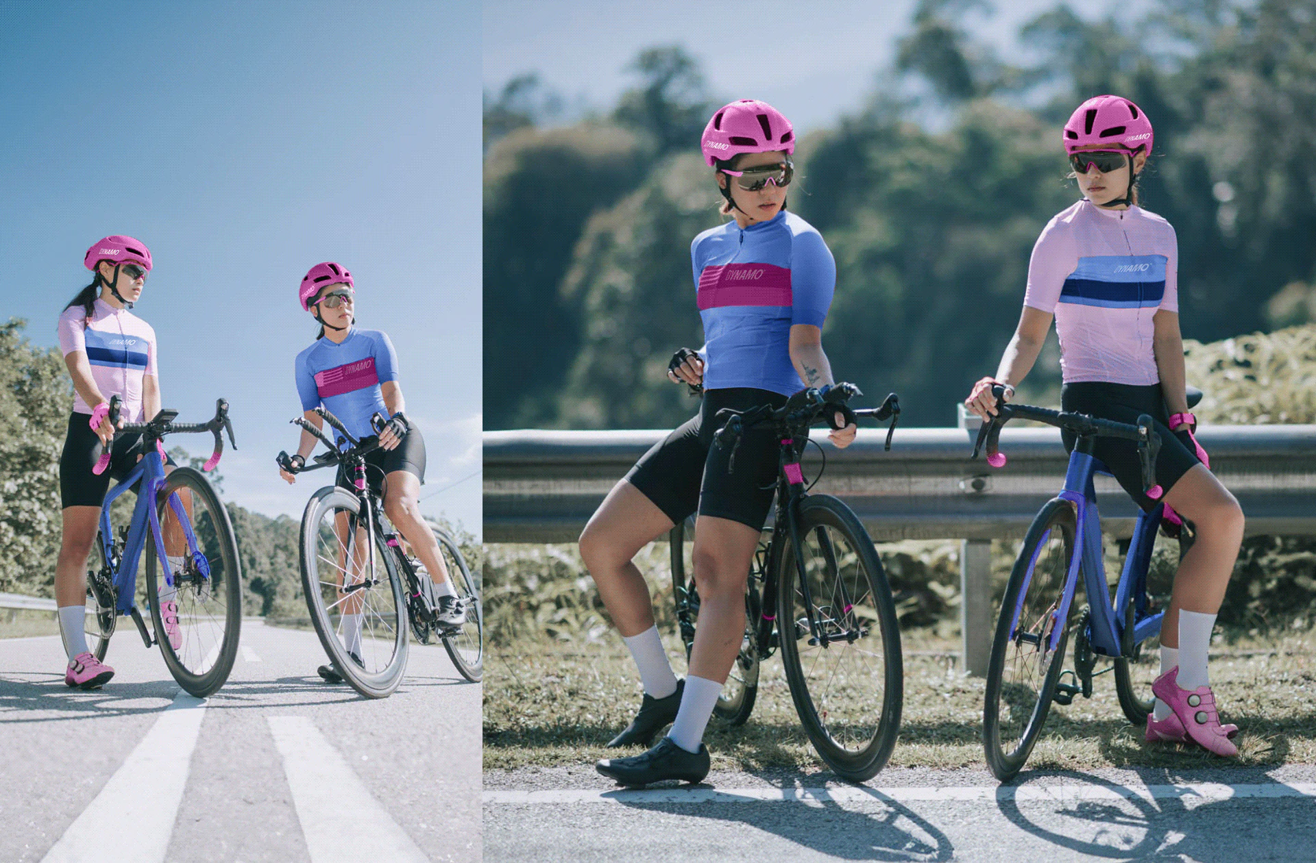
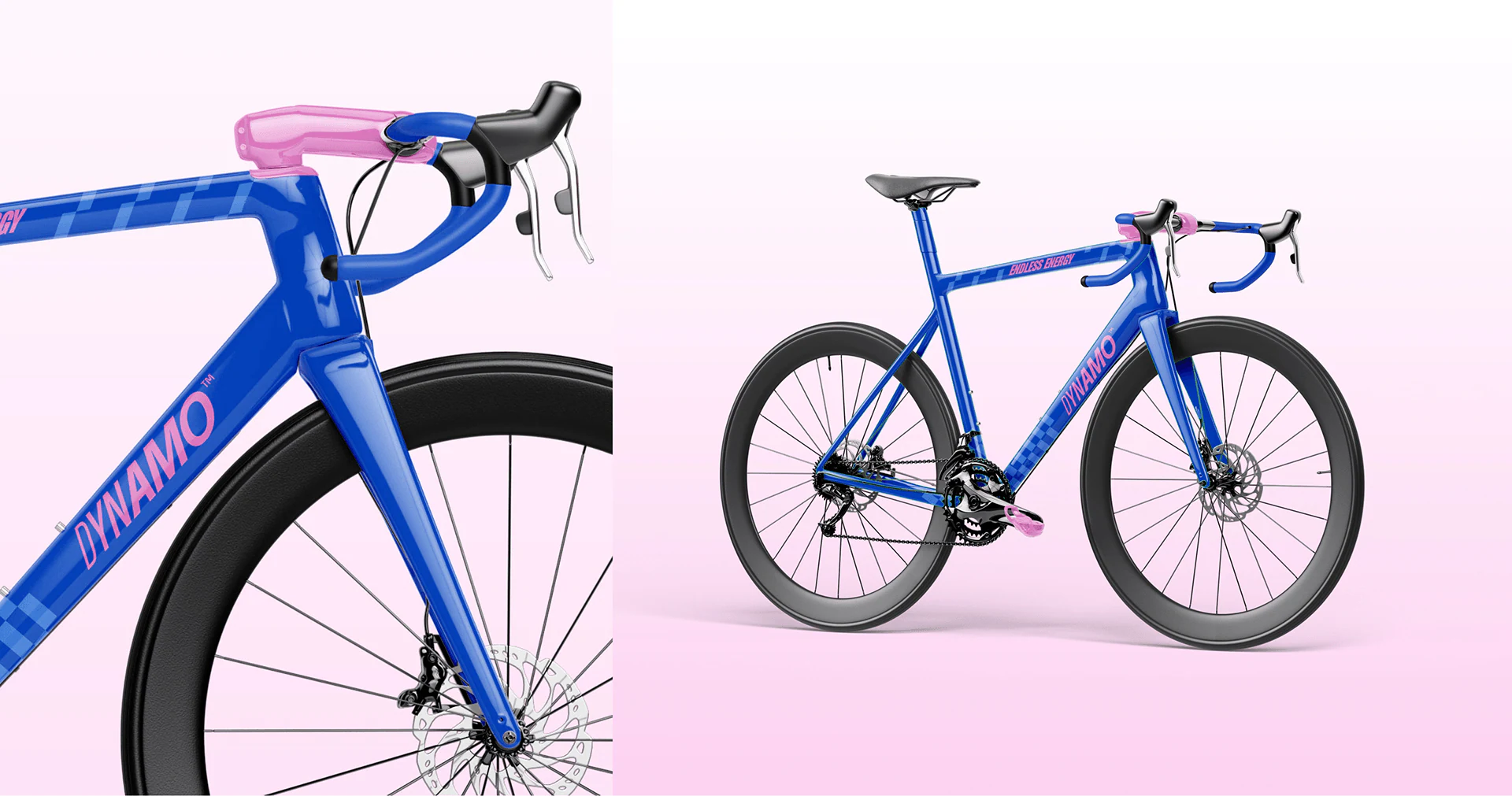
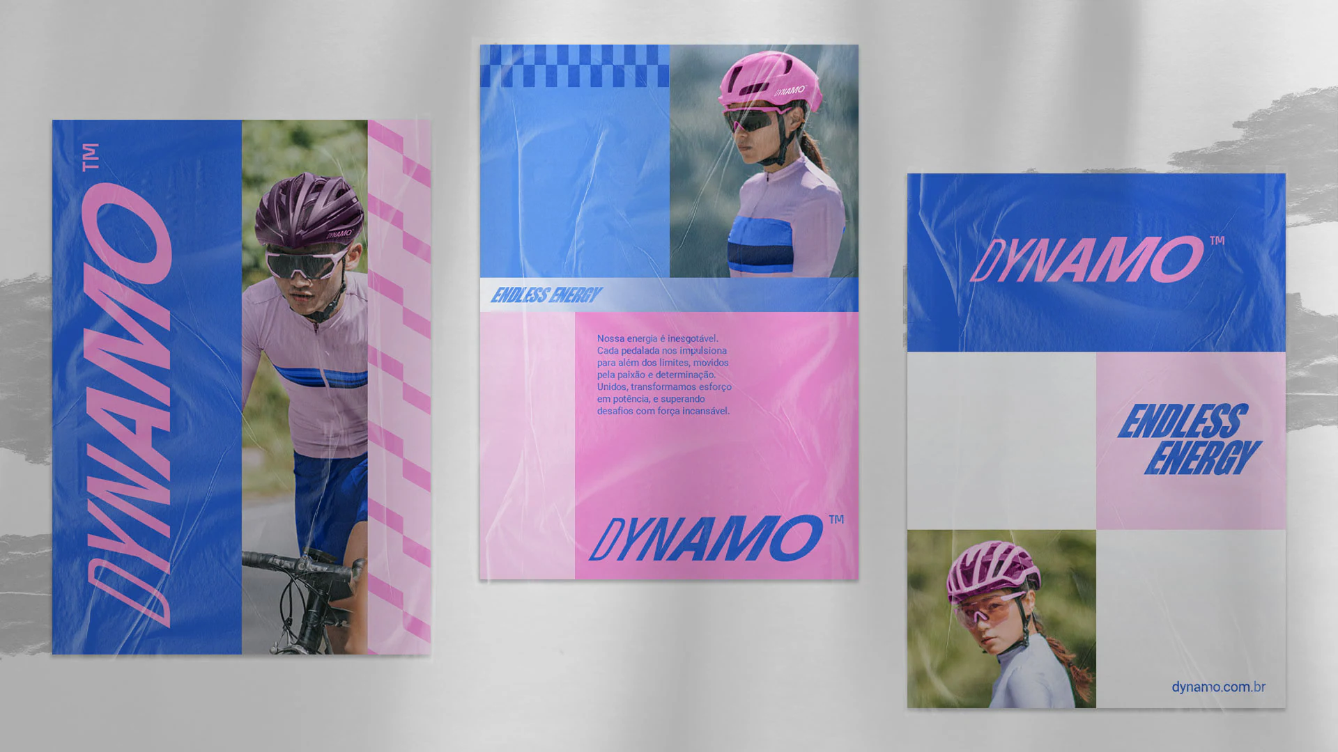
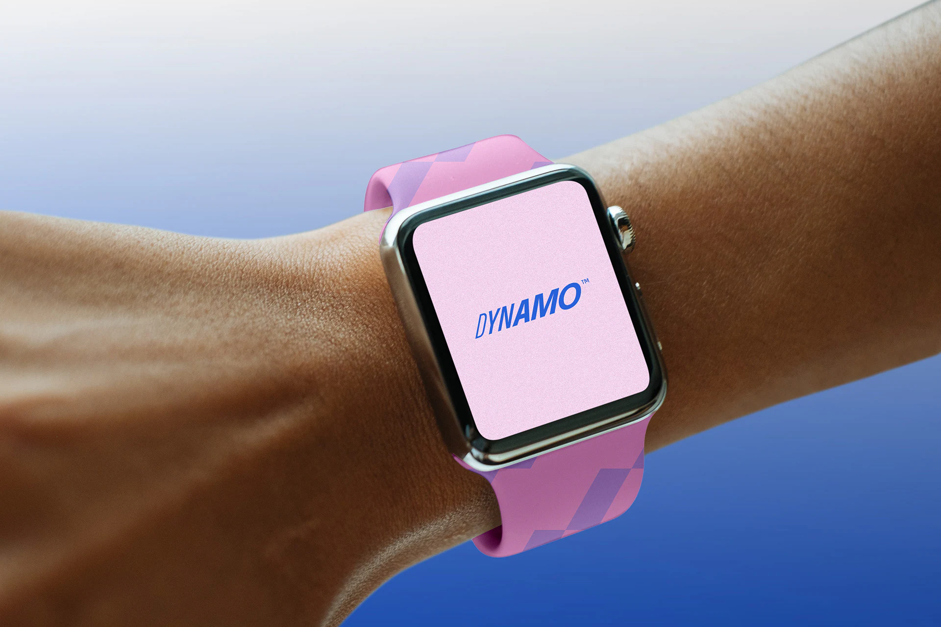
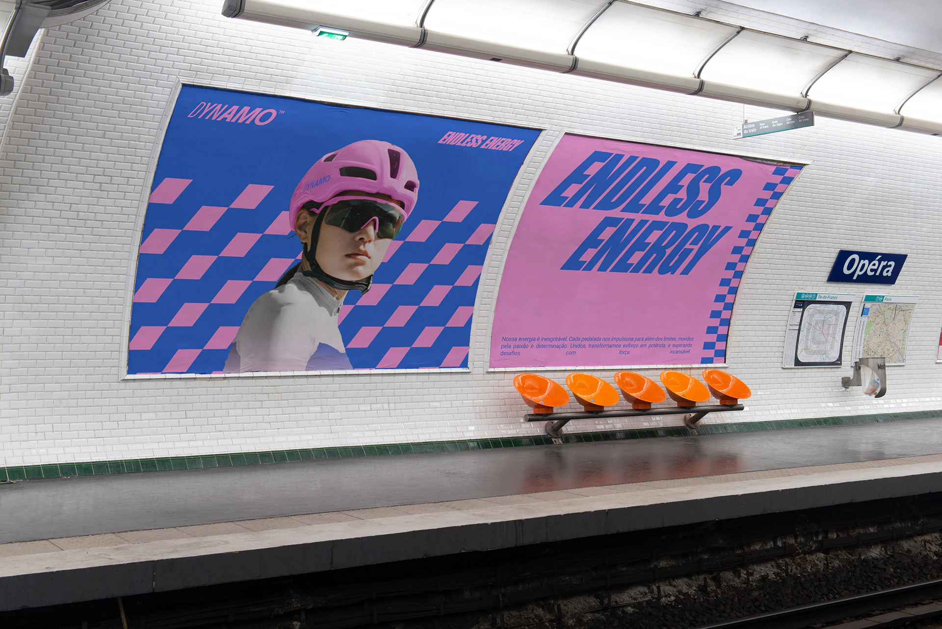
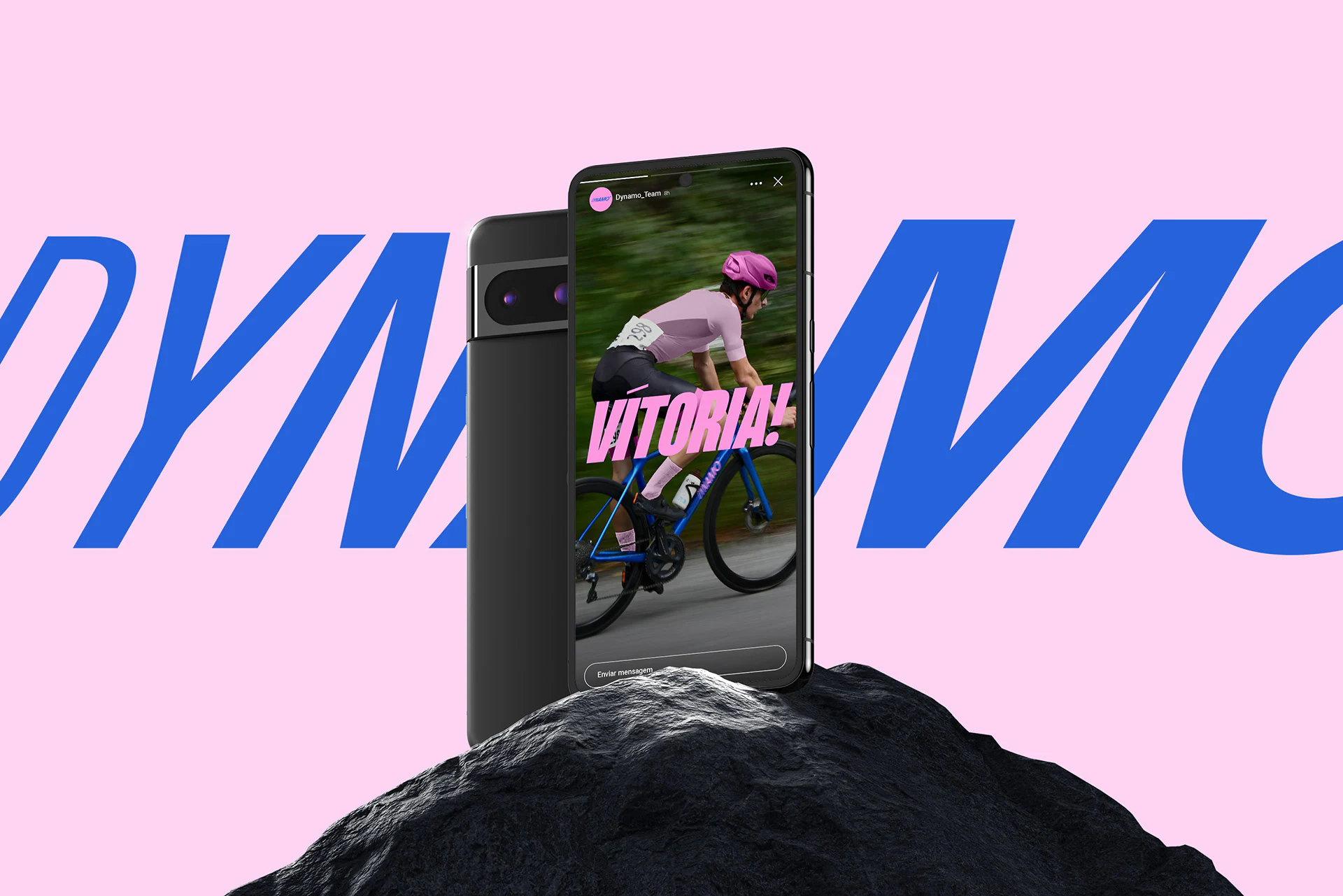
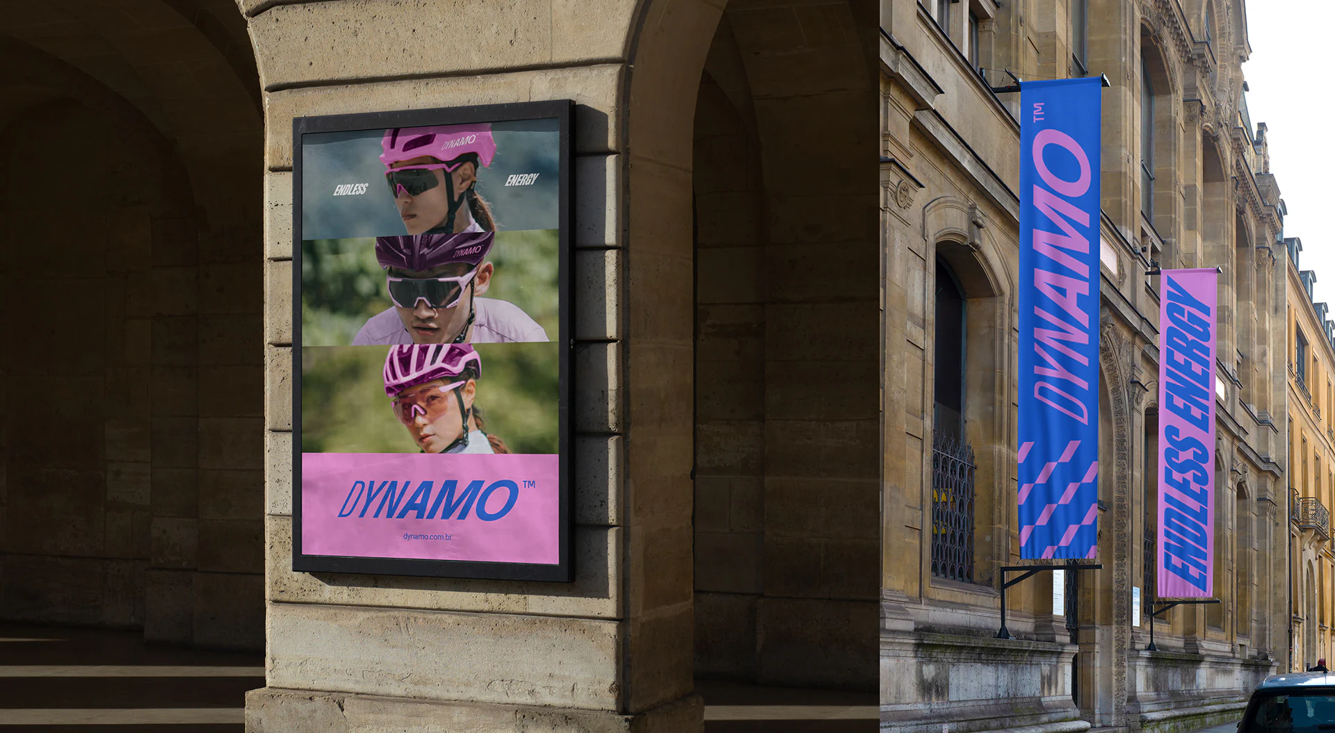
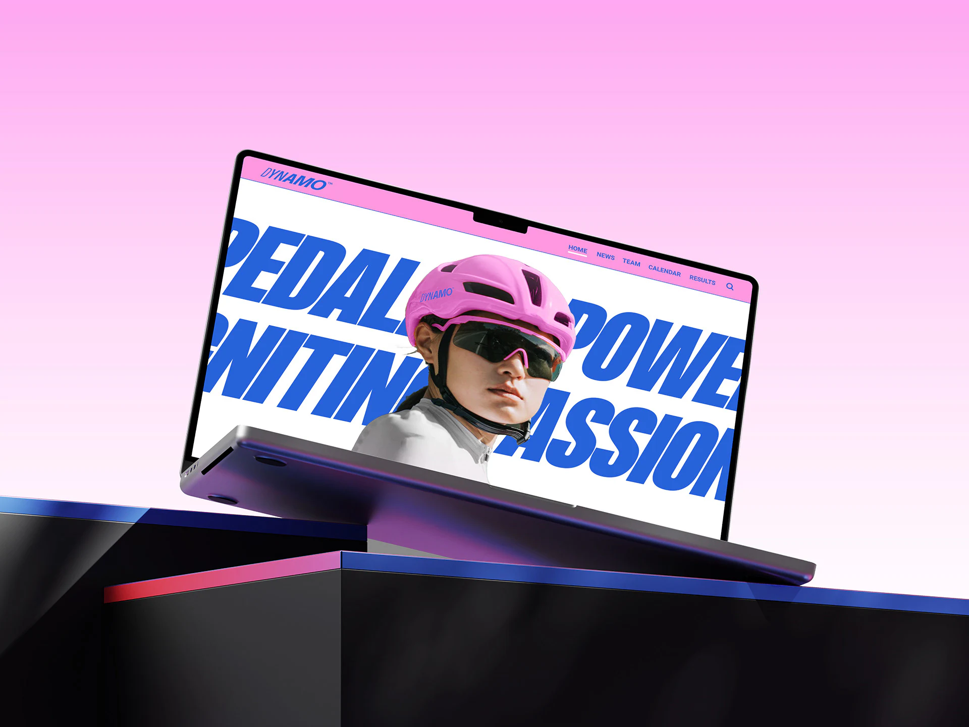
The name supplied the central idea. Like the mechanism that converts motion into electricity, Dynamo transforms physical effort into visible energy. A charged color palette, assertive typography, and a fast graphic language give the team instant recognition at speed—an identity made for cyclists who want their ambition to be seen before the finish line.